Earlier this year, 9to5Google spotted the first signs of a Google Maps makeover, which seemed to prioritize showing more of the map at all times. Oddly, the partial rollout was apparently reverted a few weeks later, and it appeared that Google had decided that the old UI was superior after all.
But it seems to have just been a postponement of the rollout. In a new post, 9to5Google describes how the new UI has returned, with some refinements along the way.
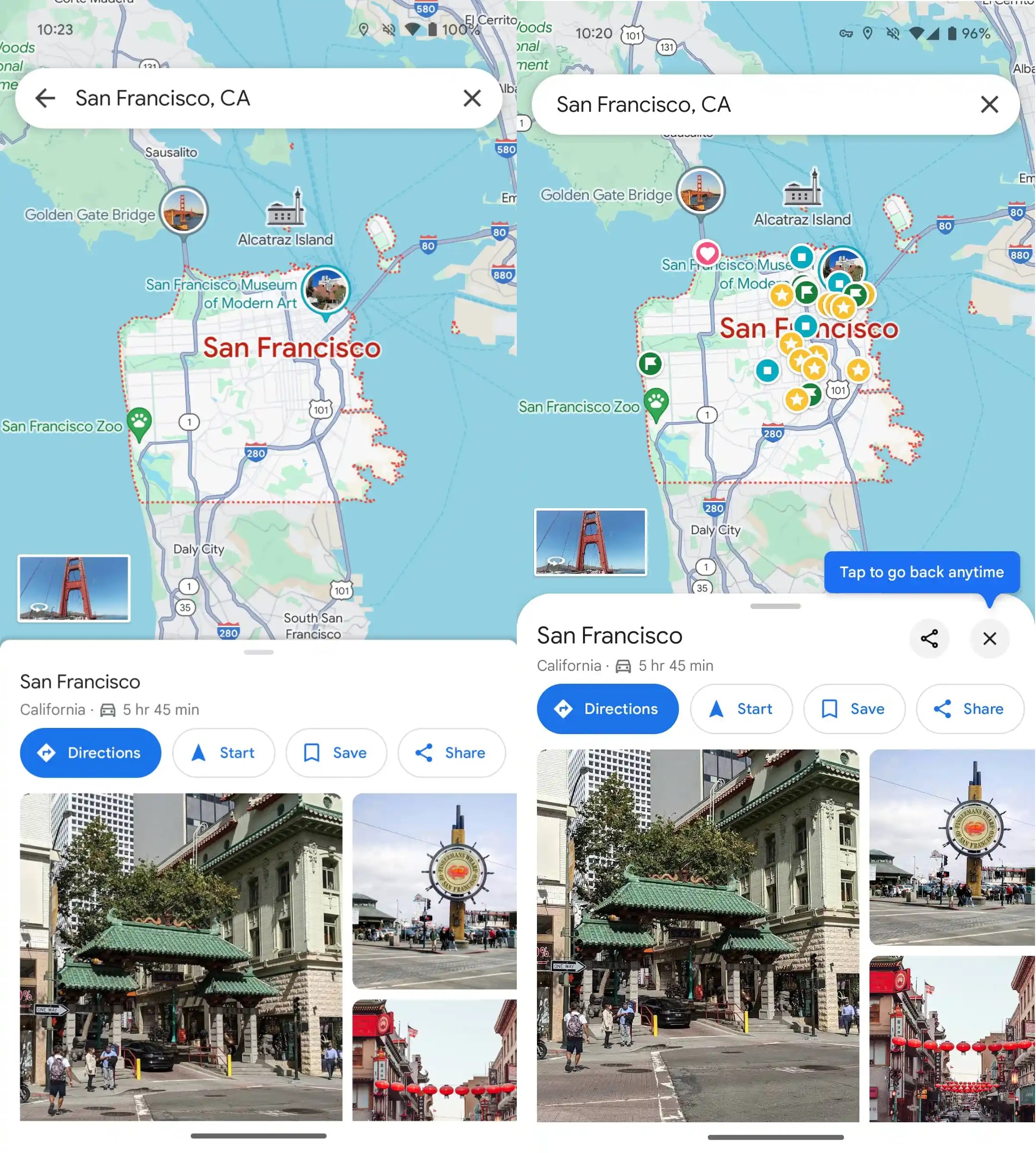
As with the original update, the aim appears to be to ditch fullscreen overlays, instead providing users with sheets that appear on top of the map, keeping at least some of it visible, as you can see below.
Overlay layers appear to have much more rounded corners, and they can now be banished with a simple tap of the close button in the top right-hand corner, next to the ‘share’ icon.

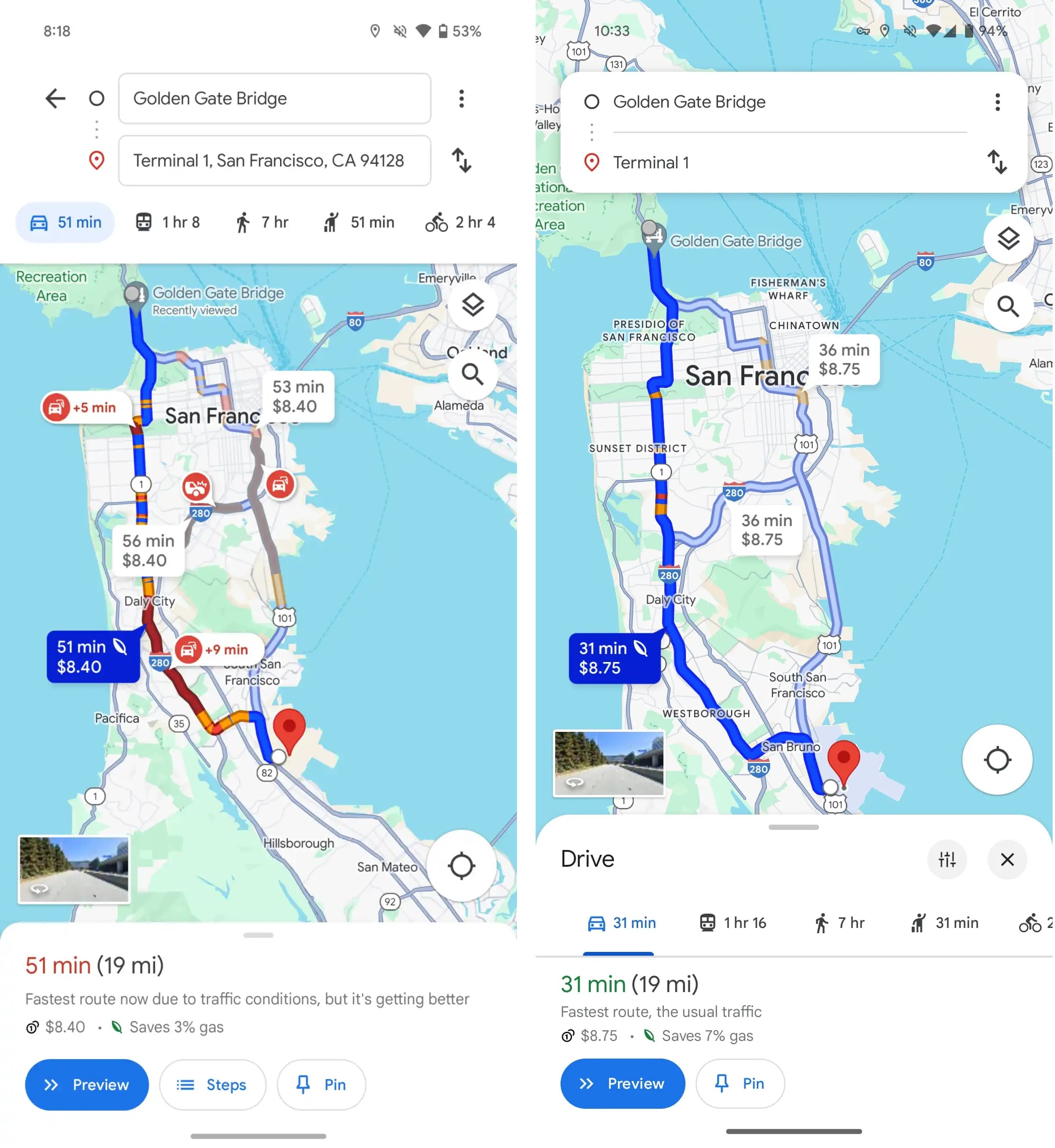
The biggest change comes when you’re actually looking to plug in directions — probably the main time people use the app. As you can see in the screenshot comparison below, it’s been simplified with a floating island to put in your start location and destination, with the driving, transit, walking, ride-hailing and cycling options moved to an island at the bottom.

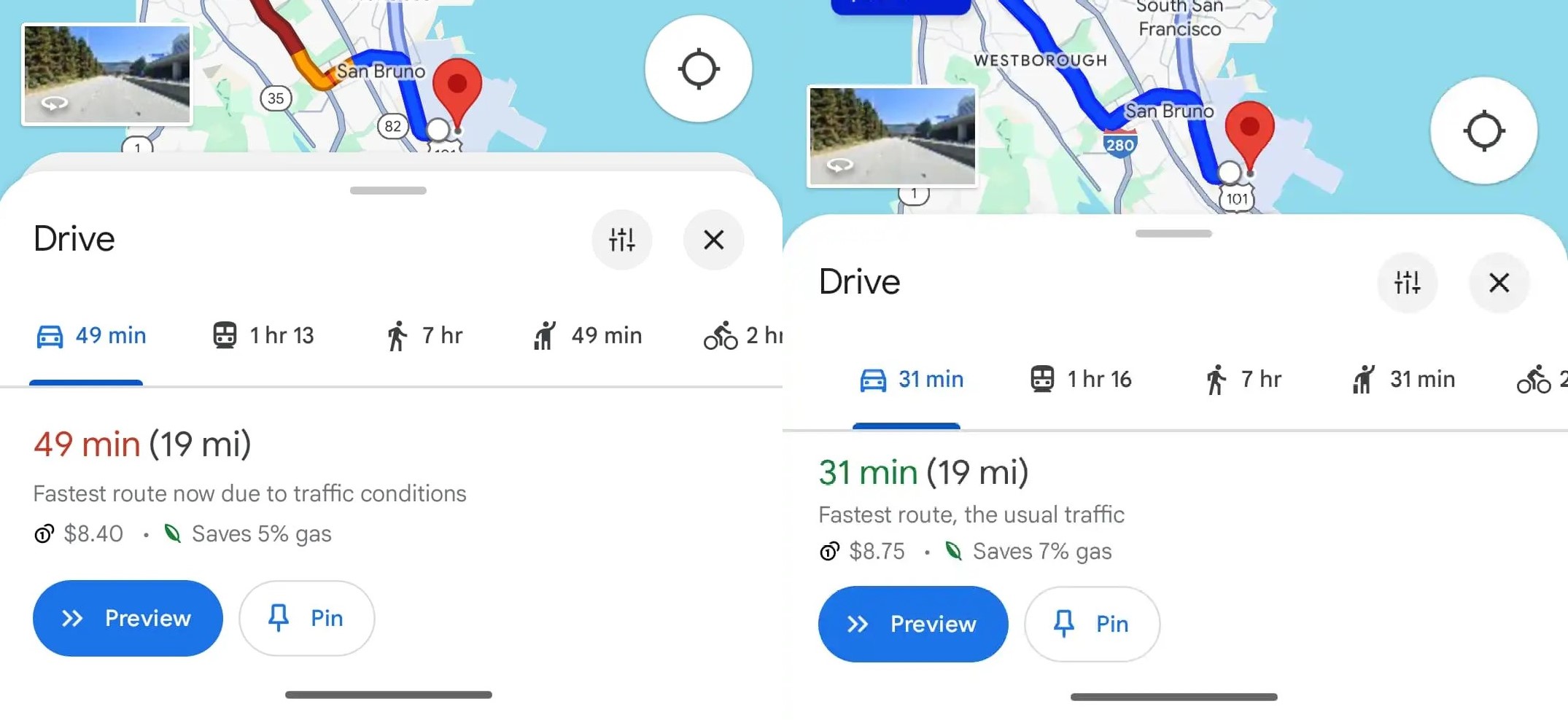
In all, it appears to be a fairly modest upgrade on the previous pulled makeover. Indeed, the biggest noticeable difference is that the contextual sheets are no longer double-backed:

It’s undeniably a minor change, but it does make things look a little cleaner and lets you see a bit more of the map.
At the time of writing, the server-side update — version 11.127.x on Android — hasn’t been widely rolled out, which suggests it may still be in testing, and could even potentially be pulled again.
Nonetheless, it’s clear that this is an update that Google has been experimenting with for at least three months, so it seems likely it will roll out to all users in some form or other in the near future.


